Just because something can be done doesn’t always mean that it should be. From tacked on features that are only added to say that it’s there, to designing user interfaces that give too much information at once, these are common pitfalls we all get sucked into. The thought process behind design of function and usage is not something to be ignored and well designed products makes everyone’s lives better.
Too Many Features
Sometimes a manufacturer adds features to a new device just because it is the buzzword of the day. Megapixels, HDR, 4K and slow motion are all examples of features that can be added to a product to seemingly increase its value without actually being useful. A camera that can shoot at 240fps but only does so at 720p or lower resolution has a much lower value than one that can shoot at 60 or 120fps but can do so at 1080p. Similarly, more megapixels does not mean that the camera is better, only that there are more pixels. A camera with better pixels will perform better in an average situation than one with more pixels.
Too Much Information
An overwhelming amount of information can be just as useless as too little. A cluttered screen means that you have to split your attention between too many points of information, much of which isn’t necessarily useful at the moment. We all know the feeling of having to start researching for a paper and not knowing where to start because there are so many angles to look at. The same principle works when designing what information to show on a screen and more importantly when. When your device only gives the relevant information, users can spend their brain power making more important decisions.
Specialization
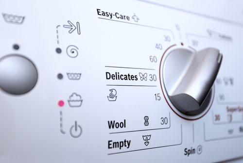
Some devices can only do one thing. But if they do it extremely well, there isn’t a problem. Not every appliance needs to be connected to everything else. Doing so can cause an information overload for the user. A toaster with a timer can make toast just as well as one with variable temperature control, fancy dials and a coffee maker. Complexity should not be an aspect of your device that you have to interact with. A well-designed system should make the decisions that make it better on the inside, not on the outside. High-efficiency washers, for instance, know the correct amount of water to use, and there is never a time when it has to ask the user what to do.
The Sweet Spot
Not every device has to be so simple a child can use it. There is a sweet spot with all of these aspects. If you dabble in photography, then an entry-level point-and-shoot might not be the best option for you. At the same time, the highest-end cameras on the market might be too much. The same can be said of any type of device.
For the most part, today’s technology manufacturers know that the inside of their devices are far too complex for a lay person to understand every aspect. Companies like Apple and Google strive for users to just be able to pick up a device and know intuitively how to use it. Remember: If an everyday device is too complex, you aren’t going to want to use it.

